
Visual organisation
Illustration, photography and graphics
Visual Organization
Summary
The visual organization of a newspaper’s front page makes it easy to scan and understand its content. The big headline and photo at the top of the page make finding the most important story easy. Other headlines are smaller but still stand out. The space between each news story makes it easy to see where one story ends and the next begins. Web pages, documents, and other media should be as easy to scan and understand as a newspaper.
Overview
Most people don’t look at a page and read the content word-by-word. Instead, they quickly look over the entire page, trying to pick out what type of information is on the page and what is important to them. If they are looking for specific information, they often jump directly to that section of the page. This process is known as scanning.
The visual organization of a page provides reinforcing cues, also known as wayfinding cues, that increase scannability by helping people locate and focus on the content they need. These visual cues use size, color, location, contrast, similarity, boundaries, and space to help people intuitively understand content. They establish a visual hierarchy that organizes content into successive levels based on importance. They help viewers understand the content’s structure, navigate through the content, focus on key information, and complete needed tasks. Good visual organization makes content easy to scan and understand.
Take a quick look at a web page. It should be easy to:
-
Find and focus on essential actions and information.
-
Understand which parts of the content are related to each other.
-
Understand the logical hierarchy of the content.
Headings are one example of these concepts. Top-level headings (level 1 headings) are always larger, bolder, or more colorful (or sometimes all three of these) than secondary headings (level 2 headings). Varying the appearance of headings in this way provides intuitive wayfinding cues to individuals who can see the content. When you glance at the heading example below, the size of the headings should tell you:
-
The relative importance of each section of content.
-
The hierarchical relationship of one section of content to another.
Visual Organization (Heading Level 1)Summary (Heading Level 2)The visual organization of a newspaper makes it easy to scan and understand its content. The big headline and photo at the top of the page make finding the most important story easy. Other headlines are smaller but still stand out. The space between each news story makes it easy to see where one story ends and the next begins. Web pages, documents, and other media should be as easy to understand as the newspaper. Overview (Heading Level 2)Most people don’t look at a page and read the content word-by-word. |
Watch this short Clear Layout and Design video from the Web Accessibility Initiative to see how a well-designed visual organization supports people with disabilities while providing a better experience for everyone.
Who is Helped
Most individuals with cognitive and learning disabilities benefit from:
-
A standard, consistent visual layout as people require less cognitive effort to find features or content they're looking for when page elements are predictable and similar to other sites they already know.
-
A page layout with a clear structure and hierarchy makes finding and focusing on needed content easier.
-
Important content and key tasks placed near the top of the page or highlighted so they stand out from surrounding information. Techniques like this make it easier to find needed information without searching an entire page or reading through large amounts of text.
People with disabilities related to concentration, reading or processing written content, executive function, or memory benefit from:
-
A consistent visual structure helps people remember where things are located, making them more likely to find what they want.
-
Content organized into distinct sections with clear headings helps people easily find and focus on needed information. This functionality also helps slow readers and anyone who has difficulty reading large amounts of text.
-
Clear wayfinding cues, such as familiar icons, borders, and layouts. If these individuals are distracted while working online, they may not remember where they were without these aids.
People with autism, dyslexia, attention deficit hyperactivity disorder (ADHD), and other cognitive and learning disabilities related to understanding written language or maintaining focus benefit from:
-
Visual cues that reinforce content and page structures, such as borders or white space used to identify related content and cards or callout boxes that highlight key content.
-
Chunking content makes it easier to find and focus on key content. This functionality is especially helpful for people with attention-related disabilities.
People who rely on assistive technologies benefit from:
-
When the page's visual structure is reflected in the code, it helps people who rely on assistive technologies like screen readers or voice-control software. For example, good headings help screen reader users understand a page’s content.
Everyone benefits:
-
Ultimately, good visual organization benefits everyone. It reduces our cognitive load, making it easier to scan a page and find the information we need quickly.
Design Principles
Words alone cannot quickly make the content’s structure clear or enable people to understand the relationships between one part of the content and another. Reinforcing visual cues help everyone understand the content’s hierarchy and relationships at a glance. These cues lead people naturally toward crucial information and tasks without conscious effort.
Four Key Principles
Four key visual design principles help people quickly scan and understand a page:
-
Emphasize what’s important.
-
Reinforce relationships.
-
Support structure and focus attention.
-
Be consistent and use what’s familiar.
These are not the only considerations that go into creating a good design but they are the principles that most impact someone’s understanding of visual organization. This impact can be significant for people with cognitive and learning disabilities.
You shouldn’t rely on visual cues alone to define hierarchy, relationships, or structure. There is a close connection between a page’s visual organization and the underlying page and content structures. Visual organization can support and reinforce the page and content structures; it can’t create them. Designers must consider all three structural aspects from the beginning of a design and ensure they work together to achieve a usable, accessible result.
See Understanding Page Structure (Ta11y) and Content Organization (Ta11y) for information on creating structured and organized content.
Principle 1: Emphasize What's Important
Use location, scale, and contrast to make key content and critical tasks or actions stand out and reinforce their relative importance. The viewer’s focus should naturally move to the most important content first, then to the next most important content, and so on. People should be able to quickly locate essential elements, such as navigation, search, headings, and other key tasks and information.
Impact: Helps people quickly locate the most important information and tasks.
Use these techniques to make key content and critical tasks stand out:
-
Location: Put key content closer to the top of the page.
-
Scale: Make important elements larger than less important content.
-
Contrast: Make important elements visually distinct from less important content.
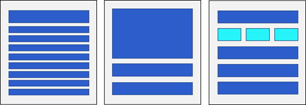 Figure 1: Location, Scale, and Contrast
Location: Put the most important information and tasks at the top of the page so they are seen first. Ensure important information is always visible.
-
Avoid making users scroll the page to see important content.
-
Avoid making users hover over an element or open another window to see important content.
Scale: Make more important sections of content larger than less important sections. People should understand the content’s hierarchy intuitively based on cues like heading and image size.
-
Make headings larger than other text elements so they stand out.
-
Large, visually distinct headings make it easier for people to identify each section of content.
-
Headings should generally be about 20% larger than regular text and can also be bold for even greater emphasis.
-
Changes in heading size help people intuitively understand the content hierarchy.
-
-
Use larger images and buttons to draw viewers' attention to more important information and tasks.
Contrast: Use color, shape, or other differences to direct attention to more important information and tasks:
-
Use brighter, lighter, or warmer colors to make objects stand out from grayer, darker, or cooler colors.
-
Use shapes, textures, patterns, and other differences in the same way.
-
The stronger the contrast, the more attention an object will draw.
Use these techniques sparingly to reinforce the truly significant sections of content. If every object on a page is large, bright, and colorful, nothing will stand out as particularly important. Use visual cues in ways that support the information hierarchy of the content without overwhelming it.
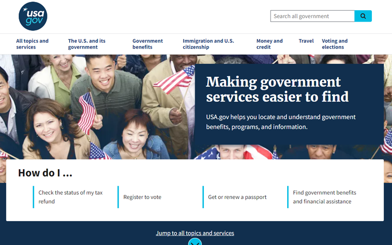 Figure 2: Emphasize Important Content
The large image and headline on the USA.gov home page leave no doubt that “Making government services easier to find” is the primary purpose of this site. They are placed near the top of the page and are much larger than all other content. The colorful image stands out from the nearby solid color backgrounds.
It’s also easy to see which services are the most important. Immediately after the image, a large white space draws your gaze to a secondary heading and four critical links. This is the information most people are looking for on this site: tax refund status, voter registration information, passport information, and government benefits and financial assistance.
Each section of this page uses location, size, and contrast to make its relative importance obvious and help people find key content and critical tasks.
Principle 2: Reinforce Relationships
Proximity, contrast, similarity, and grouping are visual design techniques that can reinforce the relationship between the elements on a page. The viewer can intuitively understand that they are related when you place elements with the same appearance closely together. Similarly, elements within a border or other boundary will appear to be related, while elements that fall outside of the boundary are understood to belong to another group.
Impact: Helps people understand the relationships between different content areas.
Use these concepts to reinforce the relationships between sections of content:
-
Proximity: Place related elements close to each other.
-
Similarity/Contrast: Design related elements with a similar appearance.
-
Grouping: Group related elements within the same boundary.
Proximity: Co-locate related content.
-
Proximity reinforces the idea that elements or objects are associated.
-
Distance makes even similar objects appear to be separate and unrelated.
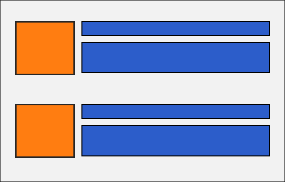 Figure 3: Use Proximity to Group or Separate Objects
Similarity/Contrast: Use similar shapes, colors, components, alignment, orientation, etc., to indicate elements are related.
-
Similar types of content can use the same visual formatting to reinforce that they are related.
-
Different types of content can use other visual design patterns to support the idea that they are unrelated.
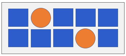 Figure 4: Use Visual Changes to Reinforce Similarity & Difference
Note: When you use color alone as a visual cue, it must meet the WCAG minimum non-text contrast requirements. If visual cues don’t have good contrast, you must include another indicator in addition to color. See Never Use Color Alone (Ta11y) for more information.
Grouping: Visually organize information into distinct sections by grouping related information with defined boundaries. Use boundaries to visually associate multiple sections of content into a single group while reinforcing the idea that this group differs from other content. These concepts are similar to using chunking to group text (see Content Organization (Ta11y) for more on chunking).
-
Use bars, borders, background colors, or shading to define boundaries and group sections of content.
-
When you use design elements like borders and background colors to group content, these elements convey meaning. Meaningful information must have at least a 3:1 color contrast ratio to the background color.
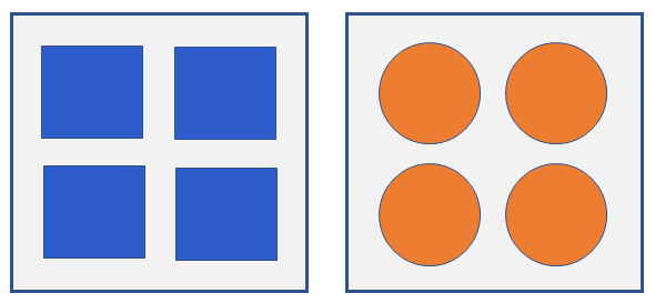 Figure 5: Use Boundaries to Group Different Content
Proximity, similarity, contrast, and grouping are all interrelated and work together in a design. These visual cues should support and reinforce the relationship between the different elements on a page.
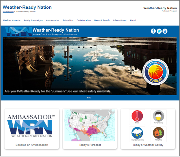 Figure 6: Reinforce Grouping & Association of Elements
The example in Figure 6 above, from the U.S. National Weather Service website, illustrates how to apply these principles in an actual design.
-
The banner at the top of the page has a white background, the carousel image has a dark blue background, and the three cards at the bottom have a white background. These changes in background color visually differentiate each section of content from the next.
-
The large, eye-catching carousel image under the banner contrasts sharply with the three smaller images in the card elements below it. The differences in size and style between the large carousel image and the smaller cards make it clear that these are two very different sections of content. They also help to emphasize their hierarchical relationship and the relative importance of each section.
-
The three cards at the bottom of the page all contain an image at the top, followed by a single, short line of text. Each card has a border that defines the relationship between the image and the text. The similarity and proximity of the three cards make it clear that this is a group of similar elements serving a similar function on the page.
Principle 3: Support Structure & Focus Attention
White space is an essential part of any design. It creates a sense of balance between the background and the elements on the page. It helps the viewer’s eye flow from one element to the next while directing attention to the most important aspects of the page. Having adequate white space makes reading easier and helps people understand the content.
White space is a term describing the background color of a page. It does not need to be white.
Impact: Spacing around and between text enhances readability. Spacing around and between elements and content chunks helps the viewer move from one object to the next while helping them focus on the most important content.
The short video “What is Whitespace?” from the Nielsen Norman Group demonstrates the relationship between text and spacing.
See Text Size and Spacing (Ta11y) for more information.
Consider these criteria when adding white space:
Readability: Adjust text spacing to maximize readability.
Structure: Balance white space to reinforce the content’s structure.
Focus & Flow: Use white space to direct the viewer’s attention.
Figure 7: Readability, Structure, Focus & Flow
The consistent, balanced use of white space throughout a design helps the viewer’s gaze move intuitively from one element to the next. Too much space slows people down as they unconsciously think about which elements are related. Too little spacing feels uncomfortable and makes reading difficult.
Readability: Put enough white space between individual text elements to maximize readability and flow.
These elements include headings, paragraphs, lines of text, lists, tables, images, and other text elements.
Structure: Add enough white space to reinforce the content’s structure and make content easier to scan.
Avoid adding so much white space that important information is pushed too far down the page or seems isolated from other content.
Avoid cramming content so tightly together that it becomes hard to read and the importance of individual sections is lost.
Focus & Flow: Use white space to guide the viewer’s attention and help important content areas stand out.
Balance white space so that the viewer’s eye moves naturally from one section to the next.
Put enough white space around different sections or chunks of content so that it is easy to identify separate sections.
Substantial white space around an object gives it greater importance.
Providing the appropriate amount of white space in a design helps keep the viewer’s attention moving from one element to the next on a page while helping the most important elements stand out. You should use white space to support and reinforce the content structure and direct the viewer’s attention to the elements on a page that matter most.
Figure 8: Support Structure and Focus Attention
This example from the Mutua11y website illustrates how to apply these principles in a design.
The space around the elements helps reinforce the content structure by visually indicating the relationship between different sections of content.
More space visually separates unrelated content sections like the banner, goal, and two cards.
Less space around content can form a visual group that indicates a close relationship, like the links in the site navigation.
The white space gives the eye a place to rest and lets viewers focus on each element individually.
The site banner uses just enough space for viewers to notice the logo and navigation without distracting them from the content. This layout helps the viewer’s eye move naturally to the next section of content.
The substantial white space around the site’s goal helps it to stand out and reinforces its importance.
The two large cards at the bottom of the page each contain an icon, title, short description, and link. There is sufficient white space around each card and between elements within each card so that:
Viewers can focus on the title and icon on each card.
Viewers are better able to read the text.
The color in the cards helps the viewer’s eye move naturally to it from the previous section of content.
Principle 4: Be Consistent & Use What’s Familiar
Consistent, familiar wayfinding cues help people understand what they see. Creating a consistent design that uses familiar elements makes it easier for people to learn how to navigate and interact with a new site.
Impact: Consistency helps people predict where to find needed information and what to do when they find it. Familiarity helps people recognize visual cues they already know.
Use these concepts to help people understand your design:
Consistency: Be consistent when you implement design elements and layouts.
Familiarity: Use common design elements and layouts familiar to most people.
Figure 9: Use Consistent, Familiar Patterns & Elements
Figure 9 illustrates these concepts. It shows a web page that uses a common page layout with the banner at the top, the site navigation below that, and then the content.
The top banner contains a logo on the left, an input field next to a magnifying glass icon in the center, and a button and shopping cart icon on the right. These elements are commonly found in website banners and the magnifying glass and shopping cart are well-known icons.
The navigation area uses another well-known icon, three horizontal bars, to access a dropdown menu and also has several links in the menu bar.
The content comes next, starting with a large carousel that includes next and previous arrow icons, with a large heading and image between them. The last section contains three card elements with a heading, four images, and a button each.
Although not shown, the footer at the bottom of the page contains help, contact, and social media links.
The website using this design changes the look and composition of the content in different parts of the site, but the banner, navigation, and footer are the same on every page.
Consistency: Usability heuristics tell us that “Users should not have to wonder whether different words, situations, or actions mean the same thing.” By maintaining a consistent visual design, you make it easier for people to learn and use the unique features and layout of a new website or application.
For example, once people learn that your site help is always located in the footer, they don’t need to think about how to get help. This lowers the cognitive load for people learning to use your website. People are able to become comfortable using a new website in less time. By using elements consistently, you eliminate confusion and reduce the time and energy people spend learning to use your website.
Place global design elements in the same location on all pages.
If help is provided, place help in the same location on all pages.
Have a consistent appearance and layout for all design elements.
Have a consistent, one-to-one relationship between elements and their meaning.
For example, don’t use a magnifying glass icon to represent both search and zoom.
Familiarity: One of the Laws of UX (user experience), Jakob’s Law, states that “Users spend most of their time on other sites. This means that users prefer your site to work the same way as all the other sites they already know.”
People have a greater sense of comfort and ease when a new website incorporates elements they already know and understand. The more you build on existing design models, the more you lower people’s cognitive load when they are learning how to use your website. By using familiar elements, you allow people to focus on the task at hand instead of spending their time and energy learning how to use a new website.
Use common layouts and visual hierarchies.
Place elements where people expect them to be.
Use common design patterns for elements like menus, links, and buttons.
Use familiar icons that people are likely to recognize.
Use common icons with their most common meaning.
Use familiar visual cues that people are likely to understand.
See Understanding Consistency & Familiarity (Ta11y) for more information.
Analyzing Visual Organization
Designing the visual organization of a page—whether on a website, a slide presentation, or a document—is a complex process that incorporates many different usability and accessibility design principles. Making the visual organization of the design accessible depends largely on the specific design principles presented in this article.
Figure 9 below, the Accessible Community Home page, illustrates how to apply these concepts to analyze a web page's visual organization.
Figure 10: Partial Web Page Showing Visual Organization of Content
This image shows two sections of the web page: Goals and Tools.
The change of background color provides a “border” that indicates these are two separate sections of content and helps define each as a different group.
There is enough space around each section to help indicate that they are two distinct groups.
The use of white space allows the viewer’s eye to move quickly from one section to the next while also letting the eye stop and focus on the most essential parts of the information: the two headings and the three tools.
Not cramming content together too closely adds to the feeling of importance that each section of information should have.
In the Goals section of the page:
A clear heading identifies this section of content and is closely located above the following text to indicate their relationship.
The heading uses larger text to indicate its relative importance compared to the following text.
There is enough space around the heading that the viewer’s eye naturally stops to rest there. This space lets viewers focus on the heading to understand the purpose of this section of content.
The text is easy to read as there is enough space around the text and between each line.
In the Tools section of the page:
A clear heading identifies this section of content and is located closely above it to indicate its relationship to the elements that follow it.
The heading uses larger text to indicate its relative importance compared to the following content.
There is enough space around the title so that viewers can quickly focus on it and understand the purpose of this section of content.
The text is easy to read as there is enough space around the text and between each line.
The formatting of all three tool areas is similar, with an image over a caption and related text. This particular visual formatting is not used elsewhere on the page. That means these three items are visually similar but unique compared to everything else. This similarity indicates that they belong to a unique group of related elements.
The close physical location of the three tools further defines them as similar elements that belong to a single group.
The tools are halfway down the page, indicating they are not the most essential content. However, the eye-catching imagery suggests that this is still important content and ensures people will notice it.
There is enough “white” space around each tool to make them distinct. The white space allows the viewer’s eye to stop and focus on each tool.
- Provide training/support to wider workforce to identify needs early, or undertake screening
- Develop the use of screening tools/approaches that enhance early identification of needs in the population
- Highlight risk factors which make children more vulnerable to poorer outcomes
- Engage in screening processes where appropriate
- Use opportunities to promote immunisation where appropriate
- Consider adherence to infection prevention and control
- Provide training/support to wider workforce to track progress on children’s developmental outcomes
- Support parents/carers/children in understanding benefits/risks of radiation exposure
Examples:
See4Schools Programme – Orthoptics pre-school vision screening undertaken in NHS Tayside: Fife Loves Life - Dietitians in NHS Fife developed a toolkit and training programme to undertake nutritional screening to support raising the issue of child healthy weight.
Raising Attainment for All – Speech and Language Therapists in NHS Lanarkshire developed checklists to support education staff to identify children requiring support, to monitor progress with speech, language and communication and identify what supports to put in place. Following testing within schools with the highest levels of deprivation, these were then also made available to all primary schools in North Lanarkshire.
Healthy Feet – MSK Podiatrists in NHS Ayrshire & Arran work directly with health visitors and families on early screening, prevention and interventions around MSK foot and ankle health and early gait patterns with a focus on social participation, structure/function, activity / independence and wellbeing.
Health Visitor Training – Physiotherapists in NHS Greater Glasgow and Clyde deliver online sessions for Health Visitors as part of the 13-15 month and 27-30 month pathway in order to provide advice and support on developmental milestones and early intervention and prevention of needs.
Speech, Language and Communication (SLC) resource for Health Visitors – NHS Education for Scotland worked alongside Speech and Language Therapists to develop a SLC supporting resource for Health Visitors to promote early identification of children with speech, language and communication needs and best practice in early intervention at each stage of the Universal Health Visiting Pathway.

 Reflection points
- What aspects of screening do you currently engage with?
- How do you promote early identification of needs in the wider population you work with?
- Who are the key partners you could collaborate with?

Illustration, photography and graphics