
Colour and contrast
Colour and contrast
Colour contrast
Whether you’re creating web pages, documents, presentations, or social media posts, colour is an essential part of design. Poor colour choices can create content that is difficult for people with low vision, colour blindness, or contrast sensitivity to see clearly.
While certain colour combinations may be visually pleasing, it is important to understand that low contrast colour choices can be a barrier for anyone with a vision impairment. Good colour contrast can also make your content accessible to anyone who may be in difficult lighting conditions e.g. on a mobile or in direct sunlight.
Web Content Accessibility Guidelines give specific recommendations for minimum colour contrast between text / background colours, and for objects like buttons, icons, and status indicators.
Colour contrast is the luminance between 2 colours. Luminance can be described as the colour brightness or saturation. Colour contrast is often represented as a ratio: black to white has the highest possible contrast ratio of 21:1. Black text on a white background and white text on a black background has the same ratio of 21:1.
Some people with sensory differences can find documents with 100% white backgrounds hard to read on a screen due to the brightness and glare. It is a good idea to add a soft grey or yellow tint to white to soften the brightness when creating documents that will be read on a screen. Using a subtle 3% tint is often enough.
The lower the contrast ratio, the higher the difficult to read. WCAG recommends not going below 4.5:1 for body text and no lower than 3:1 for heading size text and for non-text
objects like buttons or icons.
It’s important to note that these are minimums. It’s best to aim for a contrast ratio higher than the minimum to ensure readability.
A colour contrast checker is needed to work out the exact colour contrast ratio and whether you are meeting the minimum recommended contrast. You can use an online checker to input
a foreground (or text) colour, and a background colour to get the exact contrast ratio.
There are different models for describing colour, sometimes referred to as a colour space:
- Digital design requires HEX and RGB colour values.
- HEX values are 6-digit codes assigned to colour and
- RGB values are the percentage of RED, GREEN and BLUE that make up a colour
Print design requires CMYK values. CMYK values are the percentage of CYAN, MAGENTA, YELLOW and BLACK that make up a colour
WebAIM.org has a free colour contrast checker. You can also download a free colour contrast analyser from TPGi.
Accessible Color Themes
Summary
A design theme is a set of choices that define the look of an organization's brand. Designers use themes with websites, social media, print, promotional campaigns, and other similar products. Making the right color choices is critical to the design process. Defining accessible color combinations must be an integral part of the design's color choices. understandable
-
The right color choices can increase brand recognition, evoke an emotional response, and reinforce your content.
-
The wrong color choices can prevent people with color blindness, low vision, and neurodivergence from understanding your content.
Overview
Color is an integral part of any design and one of the most noticeable visual characteristics. Color helps people understand information by reinforcing the meaning of the content and emphasizing more important content. Color often carries an emotional connotation and can invoke specific feelings in people. Color can also play a powerful role in building a memorable brand for an organization (for example, Target’s red target or IBM’s “big blue” logo). For these very reasons, it is critical to ensure the colors used in your design are accessible.
While no one color theme can always meet the needs of everyone, a well-designed, accessible color theme can meet the needs of most people, most of the time. There are two guidelines to remember when choosing colors to build an accessible color theme.
-
Use color combinations with good color contrast.
-
Never rely on color alone to convey information.
Who is Helped
Good contrast helps people with color blindness, low or limited vision, and some people with cognitive disabilities that impact reading skills or are sensory sensitive reliably perceive information. Adding secondary visual cues means that people in these groups can reliably understand information without relying on color alone.
-
People with color blindness and low vision require good contrast to distinguish between colors.
-
People who are color blind are unable to distinguish between certain colors and rely on having at least one other visual indication in addition to color.
-
Avoiding oversaturated, high-contrast, or large areas of bright yellow can help people who are neurodiverse and sensory-sensitive.
-
Avoiding very high-contrast color combinations, such as black text on white, can help people with dyslexia, Irlen Syndrome, light sensitivity, and autism.
Design Principles
Take another look at the two seemingly simple guidelines needed to create an accessible color scheme.
-
Use color combinations with good color contrast.
-
Never rely on color alone to convey information.
It seems like it would be simple to create a color scheme that meets these two guidelines. In fact, creating an accessible color scheme can be complicated. It isn't choosing the colors that make this process complicated - almost any color can work in an accessible color scheme. The hard part is determining how to use the colors with each other.
Designers often ask, “Is there somewhere I can get a colorblind-safe color palette?” The problem with this question is that how you use colors in a design can make even the “safest” color palette inaccessible.
The only safe color palette is limited to black, white, and one color.
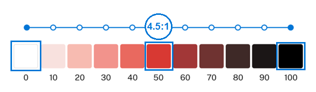 Figure 1: A “Safe” Color Palette
The gradient in this figure from the U.S. Web Design System illustrates how to choose a one-color colorblind-safe color palette. The 50% value of red in the middle of the gradient meets the contrast guidelines for text when used with either black or white (a 4.5:1 contrast ratio). When you combine this red with black and white in a color scheme:
-
People who are colorblind can perceive this color as different from black and white.
-
People with low vision can perceive this color as different from black and white.
-
The difference in contrast is significant enough to ensure color alone is not the only means of conveying information.
The color does not need to be red—it can be any color with a 4.5 to 1 color contrast ratio to black and white. This color can be used together with black and white in any way, in any part of the design, and the colors will be accessible. The problem is that few designs are so simple that black, white, and one color are all that’s needed.
Choose Color Combinations with Good Color Contrast
Here is where accessibility starts to get built into the color theme. Remember, it’s not which colors are used that determine accessibility - it’s how they are used. Any element in a design that conveys content must stand out from the background sufficiently for everyone to be able to see it.
Step 1: Identify Design Elements that Convey Content
The first step in identifying colors is to identify the elements in the design that have meaning or convey information. Aim for broad categories of elements rather than listing specific items. The colors used for these elements establish a base for the design’s color palette and must meet accessibility guidelines when used together in a design. Purely decorative elements can use any colors in any combination but should draw from the same color palette to establish a cohesive look. An example of a decorative element is a background pattern used to provide ambiance or balance in a design. Note that logos are exempt from color requirements.
Table 1 identifies elements in a design theme that typically convey information and need to meet color requirements. This list will be different for every design, but it will always incorporate some of the common elements listed here. The list includes expected elements like text, links, and background colors, but it also includes design elements known as affordances. These are visual cues or indicators that convey meaning or information. A border that groups a section of related content or a change in the color of a button when it receives focus are examples of affordances.
|
Page Element |
Function in Design |
|---|---|
|
Main background |
Main background color for the page. |
|
Main text |
Main text color; used for text throughout most of the content. |
|
Link text |
Link color; includes the default link color and may include colors for active, hover, and focus states, |
|
Secondary text |
Optional: Secondary text is used for menus, footers, headings, etc. Secondary text may be more than one color. |
|
Secondary backgrounds |
Optional: Secondary backgrounds visually separate different content areas, such as banners, footers, etc. Secondary backgrounds may be more than one color. |
|
Borders |
Optional: Borders visually separate different areas of content. More than one color may be used for borders. |
|
Focus Indicators |
Focus Indicators may be different colors on different parts of the page; they need to change if the background color changes. |
|
Indicators and Messages |
Error, Warning, Success, and Information Indicators and Messages. These often use red, yellow, green, and blue, respectively, for their colors. |
|
Buttons, form fields, and other interactive elements |
Interactive elements may need more than one color to represent different states, such as active, disabled, etc. |
Step 2: Choose Colors and Assign Them to Elements
While design themes can be complex and include a large number of colors, too many colors can be hard to balance and can distract from the content. Most designs only use a limited number of colors. Neutrals are usually the most dominant color in a design. The stronger colors, such as a brand color or an error color, are used sparingly to draw the user’s attention to a specific element. These are not hard and fast rules. A website’s landing page might use a large area of bright color to get people’s attention, while other pages in the site limit the use of brighter colors. A poster series designed for children might use bright colors throughout their design, while an ad campaign for a news agency is largely composed of neutrals with only small pops of brighter colors.
When color conveys meaning, it is best to follow established conventions for the color choices. For example, using red as an error indicator and using blue for links are both well-established conventions. Following these conventions allows people to easily understand the meaning of the colors in a design without needing to learn a new design pattern.
Typically only 3 or 4 types of colors are needed for the common design elements identified in Step 1.
-
Main, or primary, color:
-
This is usually the brand color or one of the colors from a logo.
-
This is not the color that is used the most in the design, it is the color that stands out the most.
-
The main color calls attention to the most important elements in the design.
-
-
Accent, or secondary, color (optional):
-
There can be two accent colors if needed.
-
This color should complement the main color.
-
The accent color calls attention to design elements that are not as important as those using the main color.
-
-
Neutral color:
-
The most used color in a design is usually the neutral color.
-
Typically gray or beige, this can be any desaturated color.
-
Neutral colors are most often used for text, backgrounds, borders, and form elements.
-
-
Semantic colors (colors that convey meaning):
-
These colors are most often used for error, warning, success, and information indicators and messages.
-
Follow established conventions for semantic colors where they exist.
-
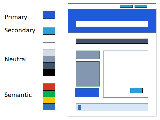 Figure 2: Web Page Mockup using Primary, Secondary, Neutral & Semantic Colors
A design can build a color palette using darker, lighter, or brighter variations of these colors. In the web page example above, a lighter tint of semantic blue is the background color for an informative message bar at the bottom of the page.
Understanding Color (Ta11y) provides information on the color theory behind selecting colors for a design. Palette generators like the Adobe Color Tool can help select colors to build an initial palette (see “Resources” at the end of this article for more information on palette generators and other useful tools).
Here’s an example of the colors assigned to key design elements from the United Kingdom’s GOV.UK Design System 1. Although this color chart does not show them, an extended color palette is available for use with other elements if needed.
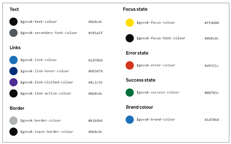 Figure 3: GOV.UK Design System Base Colors
This figure shows the seven key colors for the GOV.UK Design System Colors plus the three colors used for the link's hover, visited, and active states. These 7 key colors include bright blue, bright gold, 3 grays, red, and green. White is not shown but is used as the main page background color. The color identifier and hex value are listed next to each color for developers. This real-world design theme assigns colors to its design elements in much the same way as the basic color theme discussed previously.
-
Primary (Main) color:
-
Brand color: bright blue
-
Link (initial state): bright blue
-
-
Secondary (Accent) color:
-
Focus Indicator: bright gold
-
-
Neutral colors:
-
Main text color: dark gray
-
Secondary text: medium dark gray
-
Link (active): dark gray
-
Main background: white
-
Secondary backgrounds: dark gray, light gray
-
Borders: dark gray, light gray
-
-
Semantic colors:
-
Error Indicators and Messages: red
-
Success Indicators and Messages: green
-
-
Additional colors:
-
Link (hover): dark blue
-
Link (visited): purple
-
Step 3: Check Color Combinations for Accessibility
The next step is to test all the colors in the selected palette against each other to identify the contrast ratios of all possible color combinations. This test determines which color combinations the design can use. The best tool for checking the contrast of multiple colors against each other is a grid-based color contrast checker like Eight Shapes. Tools like this can quickly check numerous colors at one time and identify which color combinations meet the Web Contrast Accessibility Guidelines (WCAG) for good contrast.
To build the grid, replace the default colors in Eight Shapes with the selected palette colors by typing the hex values of each color, one per line, in the text box that is labeled “rows and columns.” The resulting Eight Shapes grid identifies the accessible color combinations that can be used in a website.
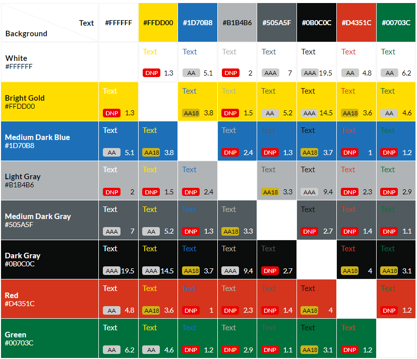 Figure 4: Eight Shapes Grid using the GOV.UK Design System Colors
This grid uses the 7 key colors (plus white) from the GOV.UK color theme. It shows:
-
What each color looks like when paired with every other color in the palette.
-
The contrast ratio for every color pair.
-
If the color pair passes WCAG AAA (7:1), AA (4.5:1), or AA18 (3:1).
-
AAA: Indicates the colors can be used together for text (any size) or affordances (visual cues) and meet the AAA WCAG requirements.
-
AA: Indicates the colors can be used together for text (any size) or affordances and meet the AA WCAG requirements. This is the commonly accepted standard for accessibility.
-
AA18: Indicates the colors can be used together for large fonts (a font size equal to or greater than 18 points normal or 14 points bold) or affordances and meet the AA WCAG requirements.
-
-
If the color pair does not pass WCAG requirements (DNP).
-
Indicates these colors cannot be used together except in purely decorative ways.
-
See Understanding Color, Contrast, and Single Sense (Ta11y)to learn more about color contrast requirements.
Step 4: Adding More Colors
Most color themes need more than the base colors used for the fundamental design elements. Typically, a design uses the base colors to create gradients that add lighter and darker shades of each base color to the overall color palette. It is particularly helpful to have multiple shades of the palette’s neutral color for borders, backgrounds, disabled buttons, and other elements in the design.
There are many ways to create color gradients. One option is to use pre-built gradients from an accessible design system like the U.S. Web Design System (USWDS). The gradients in the following figure are a sample of the many USWDS color gradients (color tokens) available in this system. The USWDS color system instructions explain which colors work with white, black, and each other to be accessible - the hard work of determining which colors can be used together has already been done. If a design can take advantage of a pre-built system like this, it makes building an accessible color palette quicker and easier.
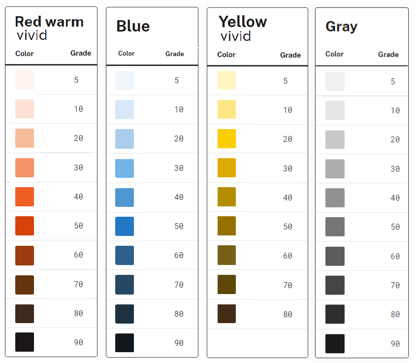 Figure 5: Four Color Gradients from the USWDS System Color Tokens
If a design must use specific colors, there are tools available that can build custom color gradients similar to those used in the USWDS. Two palette generators that create color gradients based on WCAG contrast guidelines are the Leonardo Color Palette Generator and the ColorBox Color Palette Generator. To match the change in luminosity for each of the 10 steps in the USWDS gradients, use a tool like hex code (RGB) to luminance converter to calculate the luminance of a color.
Remember to cross-check any added colors conveying information for accessibility. Most grid tools have a function that saves a palette, so adding new colors and checking the resulting color combinations in the updated grid is relatively easy.
Note: If an application is built using a JavaScript-based framework like React, Angular, or Bootstrap, these frameworks often come with their own color theme or incorporate a design system with its own color theme, such as Material Design. Most of the design systems built at this scale include accessibility considerations in their development. However, even when the design system states they are accessible, the resulting color combinations as used in a specific design must be verified. For color, that means understanding how the different colors in the design system are combined when they are assigned to different elements. Any color customization that is done will also impact accessibility. Again, use a grid tool like Eight Shapes to cross-check all the colors for contrast compliance. This provides an easy guide to which colors can be used together.
Step 5: Applying the Color Theme
Here’s an example of the GOV.UK Design System colors on an official website. The UK Visa Application page 2 is a typical page on a UK Government website and shows a real-world application of the colors from their design system.
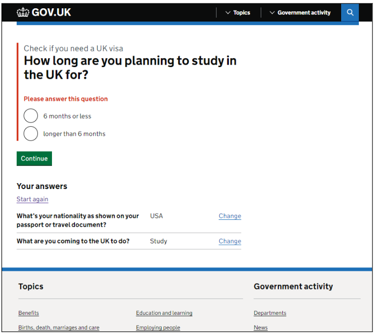 Figure 6: GOV.UK Visa Application Page Showing an Error
The web page in this figure consists of a banner, a main content area, and a footer area. It contains a form with an error message displayed, a “continue” button, and 3 links. One link has already been visited. The colors on this page have been used exactly as specified in the design system:
-
Dark gray: Banner background and text in main and footer areas
-
White: main background and banner text
-
Light gray: footer background
-
Blue: links and brand color
-
Purple: visited links
-
Red: error indicator and error message
-
Green: button (this button color is part of the extended color palette)
The GOV.UK Design System is one of many accessible design systems that have been shared on the internet. Other accessible design systems are listed under “Tools for Checking & Creating Color Palettes” at the end of this topic.
Never Rely on Color Alone to Convey Information
Choosing colors with good contrast is half the story when building an accessible color theme. The other half is that you must not use color in ways that might “hide” information from some people. This aspect of accessibility is crucial for people who are colorblind or have low vision.
The guidelines for color state that one should never rely solely on color to convey information. The two following weather maps show information about depressions, storms, and hurricanes traveling through the Gulf of Mexico, using only color to identify different weather events. One map is in color, and one is in grayscale. Without seeing the color, it is impossible to know if an event is a depression, storm, or hurricane.
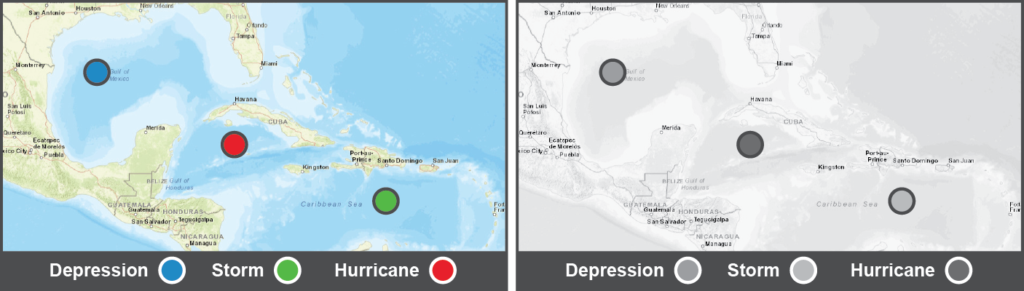 Figure 7: Weather Map that Relies on Color (Color and Grayscale)
Adding at least one additional indicator other than color is necessary for information to be understood when color is removed. Additional indicators include:
-
Text labels
-
Icons or Symbols
-
Contrast
-
Size change
-
Shape change
-
Texture or pattern change
-
Presence or absence
The next pair of images shows the same weather maps. Again one map is in color, and one is grayscale. This time the indicators for depressions, storms, and hurricanes are different shapes and sizes and have text labels placed next to each event. It is easy to understand whether an event is a depression, storm, or hurricane with or without the use of color.
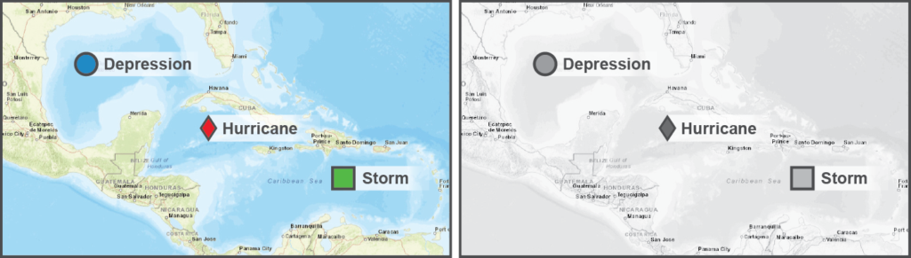 Figure 8: Weather Map that Does Not Rely on Color (Color and Grayscale)
Color must be handled the same way within a website. In the following example of a GOV.UK website error 3 for an incorrectly submitted passport date, the error is highlighted in red, but there is also a heavy red bar placed next to the error and red text added above the form field that explains the error.
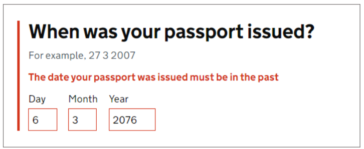 Figure 9: GOV.UK Website Error Indicators
Another common example is changing a button’s color to indicate it has received focus. Because the color change tells people that the state of the button has changed, it conveys information. This means there must be at least a 3:1 contrast between the colors used in the focused and unfocused button states to ensure most people notice this change. When a color change meets the minimum WCAG contrast requirements, the contrast is considered a second indicator in addition to the color itself. Adding another indicator, such as a border, is even better.
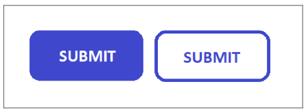 Figure 10: Submit Button, Showing Unfocused and Focused States
See Never Rely on Color Alone (Ta11y)to learn more about using color to convey information.
Best Practices
Know that while higher-contrast colors are best to support people with low vision and color blindness, other people need to avoid very bright and very high-contrast colors.
-
People who are neurodiverse are sensory-sensitive and may find oversaturated, very high-contrast, or large areas of bright yellow to be unsettling. Avoid using oversaturated colors like these whenever possible.
-
People with dyslexia, Irlen Syndrome, light sensitivity, and autism can have difficulties with high-contrast colors like 100% black text on a 100% white background. This problem is particularly true when there are large areas of white space. A dark gray text of 87% black (if on a white background) or an ivory background is a better choice to support this group.
Providing Multiple Color Themes
Although multiple color themes are not required, websites often provide more than one. For example, websites may have a dark mode that can be selected (a color theme using light text on a dark background).
If designed correctly, multiple color themes may help some people with color blindness, light sensitivity, cataracts, low vision, or chronic migraines. Different themes may also help some users adapt to their environment when switching from a bright to a dark environment. If you choose to have more than one color theme:
-
The default color scheme must meet the minimum WCAG color usage and contrast requirements.
-
Alternate color themes should also meet the minimum WCAG color usage and contrast requirements, especially if you have included them to enhance accessibility.
-
Do not create custom high-contrast color themes. Individuals who need this option control the colors on their computer’s display using specialized accessibility software or system settings.
Consider providing a single adaptive color theme instead of creating multiple color themes. An adaptive color theme has options that let individuals adjust the contrast, lightness, and saturation levels for all colors. Supporting this level of personalization helps everyone, from individuals who are color blind or have low vision to someone who temporarily needs to adjust a display due to sun glare.
-
This article on Adaptive Color in Design Systems provides a detailed explanation of adaptive color themes.
-
This example from Color & Contrast shows how an adaptive color theme can work.
Letting People Choose Their Own Colors
Selecting a color theme that will always work for everyone is impossible. Ensure people can use browser settings, platform settings such as Ease of Access (Windows OS), or assistive technologies such as ZoomText (Freedom Scientific) to override the design's colors and replace them with the colors that best meet their needs. Tools like Ease of Access and ZoomText can override color settings in both websites and documents, although most will not affect images.
Use media queries on websites to ensure user settings take precedence over the site’s defined colors. Media queries provide an easy way to support individuals who have selected preferences for alternate color themes in their operating system or browser settings. However, not everyone who would benefit from these settings is aware that they exist, so do not rely on media queries as the sole solution to provide an accessible color theme.
-
Use the “prefers-color-scheme” media query to support user selection of light and dark themes.
-
Use the “prefers-contrast” media query to support user selection of a high-contrast color theme.
By adding a media query, color settings controlled by a website’s Cascading Style Sheet (CSS) can be automatically disabled or replaced with a different action. You can add the media query code to the website’s CSS. Most browsers support media queries.
-
See Color Control (Ta11y) for more information on using these media queries.
-
For information on implementing these two media queries, see prefers-color-scheme and prefers-contrast in the Mozilla Developer Network (MDN) References.
Tools for Checking & Creating Color Palettes
A wide variety of tools can help choose and check accessible colors to create an accessible color theme. These tools fall into four basic categories, with some overlap as many of the tools are multipurpose. A few tools are listed below for each category.
-
Color contrast checkers:
-
Basic contrast checkers compare two or more colors against the WCAG color criteria and return contrast ratios and pass/fail results. Some contrast-checkers include additional features such as color blindness simulators.
-
WebAIM Color Contrast Checker and the Colour Contrast Analyser are two good contrast checkers, but many others are available. Colour Contrast Analyser is one of the few desktop tools available for checking color contrast.
-
Eight Shapes is one of the available grid-based color contrast checkers. These tools can often simplify and speed up testing by checking many color combinations at one time.
-
WCAG 2.1 Color Contrast Checker for Figma is a basic contrast checker available as a Figma plug-in. This plug-in is a handy addition to the Figma toolkit for designers working with this popular interface design application.
-
-
Color blindness simulators:
-
These tools process colors through color blindness filters to show what the colors look like for different types of color blindness. While these are simulations, they can help evaluate color combinations.
-
You can simulate the effect of color blindness by viewing or printing the content in grayscale.
-
Color Oracle and the Toptal Webpage Color Blindness Simulator are a few of the many color blindness simulators available. Color Oracle is one of the few color blindness simulators available as a desktop tool.
-
Some multi-purpose tools like the Colour Contrast Analyser include both contrast checkers and color blindness simulators.
-
-
Color palette generators:
-
These tools can build a palette of multiple colors and identify, at a minimum, which colors work with white or black text for a specified WCAG level. Some palette generators test against WCAG levels, and some test all the colors in a palette against each other. Some generators build gradients of multiple steps for each color in a palette.
-
Adobe Color Tool: This tool can generate an initial color palette based on a brand color, logo, image, or one of Adobe’s pre-built color palettes. The palettes are based on established rules for building color schemes designed around the color wheel and can help select colors that work together. The Adobe Color Tool includes an accessibility contrast checker and a unique simulator that provides feedback on which colors in the chosen palette can safely be used together for different types of color blindness.
-
Paletton and Muzli Colors: These palette generators create color palettes based on an initial color and use established rules designed around the color wheel, similar to the Adobe color tool. However, each has a unique approach. They do not include accessibility checkers or color blindness simulators.
-
Leonardo Color Palette Generator and ColorBox Color Palette Generator: These tools are good options for building color gradients based on WCAG contrast guidelines.
-
-
Accessible design systems:
-
These design systems have pre-built color palettes and include guidance on using the provided colors in ways that meet accessibility guidelines. They are worth exploring to see how they selected and used colors in their components and layouts. These systems are good examples of how color can be used accessibly, even in complex designs.
-
The GOV.UK Design System and the U.S. Web Design System are two accessible design systems.
-
A few of the many other systems that consider accessibility in their design include the W3C Design System, Adobe Spectrum Design System, Google Material Design System, IBM Carbon Design System, Shopify Polaris Design System, and Salesforce Lightning Design System.
-
See Color Tools (Tally) for more information on the different color-checking tools available and examples of each type of tool.
Foundations: colour contrast
Posted on Friday, 4 February 2022 by Henny Swan in Design and development
Good contrast is about using colours that provide enough variation between the content and background. This is particularly important for people who have conditions that affect vision or colour perception, as well as people browsing on mobile in different light conditions.
People find it difficult to read content for many reasons:
- Colour Vision Deficiency, otherwise known as colour-blindness, means some people have difficulty recognising certain colours or any colours at all
- Ageing impacts people's ability to see colours
- Differences in device size, resolution and contrast can all affect colour quality
- Bright conditions, such as sunlight, can reduce someone's ability to see what's on the screen clearly
Another consideration is the psychological impact colours can have on some people:
- People with Autistic Spectrum Disorders can be sensitive to sensory information including very bright or high-contrasting colours
- People with Dyslexia can find text on a pure white background dazzling and difficult to read
- People with low vision can find text on a patterned or textured background difficult to read
 Steve, a deaf and low vision photographer and poet, would like to see better use of colour contrast and bigger font sizes in menus.
Colour contrast ratios
A colour contrast ratio describes the colour of an object (such as text) against the colour of its background. It's written as object:background - for example 4.5:1.
In some cases, it's necessary to think about more than one contrast ratio per element. For example, the colour of a button must contrast clearly against its background, and the button's text label must also contrast well against the button's colour.


Contrast rules for text
There are two contrast requirements for text:
- Large text (at least 24px, or bold and at least 19px) should have a minimum contrast ratio of 3:1
- Small text (less than 24px, except for the bold rule outlined above) should have a minimum contrast ratio of 4.5:1
Contrast rules for graphics and user interface components
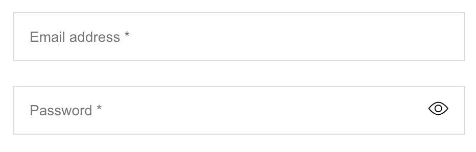
A contrast ratio of 3:1 is required for graphics containing information needed to understand the content and interactive elements. This includes form fields, links and buttons, and any visual cues that indicate their state.
Exclusions to the contrast rules
There are some types of content that don't need to meet colour contrast requirements:
- An image of text that is not essential to understanding the meaning of the content
- A decorative graphic that does not have any meaning or purpose
- Text which is part of a logo or brand identity
Tips for colour contrast
- View your content on a mobile when outside to see if it is still readable in different light conditions
- Always try and exceed the colour contrast minimum, not just meet it
Related standards
- WCAG 2.1 Success Criterion 1.4.3 Contrast (Minimum) (Level AA)
- WCAG 2.1 Success Criterion 1.4.11 Non-text Contrast (Level AA)
More information
- TPG: Colour Contrast Analyser
- NoCoffee Vision Simulator for Firefox
- W3C Perspectives: Color contrast
- ID24: Rethinking color contrast by Jared Smith
Next steps
Read more accessibility foundations posts or sign up for Accessibility Unlocked, our free six-day newsletter series designed to help you kick-start accessibility.
Henny Swan
Henny is a Director. She specialises in embedded and sustainable accessibility, inclusive user experience and design.
Having started her career focusing on the usability of dual language web platforms in China in the late 1990's, Henny moved into accessibility on her return to the UK in the early 2000s. Since then she has worked for the RNIB, Opera Software, TPGi and the BBC. It was at BBC she developed her passion for inclusive TV and streaming experiences.
Henny is co-author of the Inclusive Design Principles, was lead author of the BBC Mobile Accessibility Guidelines, and is a regular speaker at conferences. In 2022 Henny graduated the Goldman Sachs 10,000 Small Businesses.
Henny Swan
© TetraLogical Services Ltd. All Rights Reserved. Company number 12951928.

How can AHPs contribute to this aspect of public health?
- Provide training/support to wider workforce to identify needs early, or undertake screening
- Develop the use of screening tools/approaches that enhance early identification of needs in the population
- Highlight risk factors which make children more vulnerable to poorer outcomes
- Engage in screening processes where appropriate
- Use opportunities to promote immunisation where appropriate
- Consider adherence to infection prevention and control
- Provide training/support to wider workforce to track progress on children’s developmental outcomes
- Support parents/carers/children in understanding benefits/risks of radiation exposure
Examples:
See4Schools Programme – Orthoptics pre-school vision screening undertaken in NHS Tayside: Fife Loves Life - Dietitians in NHS Fife developed a toolkit and training programme to undertake nutritional screening to support raising the issue of child healthy weight.
Raising Attainment for All – Speech and Language Therapists in NHS Lanarkshire developed checklists to support education staff to identify children requiring support, to monitor progress with speech, language and communication and identify what supports to put in place. Following testing within schools with the highest levels of deprivation, these were then also made available to all primary schools in North Lanarkshire.
Healthy Feet – MSK Podiatrists in NHS Ayrshire & Arran work directly with health visitors and families on early screening, prevention and interventions around MSK foot and ankle health and early gait patterns with a focus on social participation, structure/function, activity / independence and wellbeing.
Health Visitor Training – Physiotherapists in NHS Greater Glasgow and Clyde deliver online sessions for Health Visitors as part of the 13-15 month and 27-30 month pathway in order to provide advice and support on developmental milestones and early intervention and prevention of needs.
Speech, Language and Communication (SLC) resource for Health Visitors – NHS Education for Scotland worked alongside Speech and Language Therapists to develop a SLC supporting resource for Health Visitors to promote early identification of children with speech, language and communication needs and best practice in early intervention at each stage of the Universal Health Visiting Pathway.
 Reflection points
- What aspects of screening do you currently engage with?
- How do you promote early identification of needs in the wider population you work with?
- Who are the key partners you could collaborate with?

Colour and contrast