
Fonts
Fonts
Fonts
Accessible fonts, particularly sans-serif fonts, are designed for readability and ease of use by individuals with diverse visual and cognitive needs. When choosing a font, consider factors like clean letter forms and sufficient spacing. It is also important to avoid fonts with complex or decorative designs, and those that are too light or too heavy.
Font size
Font size 16px (12pt) is often recommended as a minimum
for body text within documents and on websites
Font size 18pt (24px) is often recommended as a minimum
for document headings, titles and large text elements
Font size of 20pt is often recommended as a minimum
for presentations
Ensure font size can be resized by at least 200% to allow
the user to adjust the text size to their preferred level
of comfort and clarity
For website content, use responsive font sizes to allow
users to adjust the text size through their browser settings, making it easier for them to personalise their experience
Font Choices
Summary
Making the right font and font-formatting choices improves readability. The wrong choices can negatively affect reading and comprehension, especially for people with low vision or disabilities impacted by reading or language processing skills. Font size, spacing, color contrast, line length, alignment, and familiarity can all impact readability for these individuals.
Overview
Readability is the ease with which people can process and understand text. Most people read by scanning content, recognizing patterns, and converting those patterns into meaningful information. This process allows us to read and understand text very quickly. Your font choices can significantly impact the readability of the text.
The best font choices to improve readability include:
-
simpler fonts with unambiguous letter shapes
-
common fonts that people are familiar with
-
larger font sizes
-
good color contrast
-
reasonable line length
-
adequate spacing
-
left text alignment
The right font choices help improve reading outcomes and comprehension so that people can understand what they read and complete tasks with greater ease. This guidance is especially true for people with disabilities impacted by reading or language processing skills. The Readability Sandbox provides a quick insight into how the right font choices can improve readability for everyone.
Who is Helped
People with low vision:
-
Readable fonts, larger font sizes, good color contrast, reasonable line length, and good text spacing help people with low vision or vision-related disabilities like macular degeneration.
-
Accessible fonts help people with even mild vision impairments.
People with cognitive disabilities that impact reading skills, such as dyslexia. An estimated 20% of the world's population has dyslexia, the most common of all neuro-cognitive disorders.
-
Line length, text alignment, and text spacing can impact the ability of some people with cognitive disabilities to read text easily.
-
People with disabilities that impact reading skills are helped by having common fonts they are already familiar with or fonts with unambiguous letters (fonts designed with letters that are not easily confused with other letters).
-
Having adequate text spacing is also very important for these individuals.
All of us benefit from having accessible text. Consider the examples of someone using a monochrome screen, such as a portable e-book reader, or using a mobile phone in bright sunlight. Good contrast and text spacing improve readability for both of these people.
Guidelines
Use these guidelines to ensure good readability:
-
Provide adequate font size.
-
Provide adequate color contrast.
-
Provide adequate text spacing.
-
Choose readable text styles.
-
Choose readable font styles.
-
Select accessible fonts.
-
Ensure individuals can adjust fonts.
Provide Adequate Font Size
The size of the text has a significant impact on readability. Small text is hard for most people to read, especially those with low vision. Although the Web Content Accessibility Guidelines (WCAG) do not have a minimum font size requirement, it is a best practice to avoid smaller font sizes. While some typefaces are much smaller or larger than others, these guidelines provide an adequate text size for most people.
-
Font size should be at least 12 points (16 pixels) for primary or body text.
-
Font size should be at least 10 points (13.3 pixels) for any text. A smaller size is appropriate for a copyright notice, legal disclaimer, or similar content. However, you should not use small sizes for large amounts of text, like body text.
 Figure 1: Small Fonts Make Text Difficult to Read
Many people will need text larger than 12 points. Since it is impossible to meet every person's needs, you must ensure that people can enlarge fonts themselves or zoom in and out to provide the level of magnification they need.
People should be able to adjust fonts using:
-
Alternative CSS style sheets (see Zoom and Reflow (Ta11y))
-
Accessibility Bookmarklets (see Single-Purpose Bookmarklets (Ta11y))
-
Browser Extensions
-
Browser and Platform (computer) settings (see Browser and Platform Settings (Ta11y))
-
Assistive technologies like ZoomText
Provide Adequate Color Contrast
People with low vision and people who are colorblind both rely on good color contrast to improve readability. It is essential to have sufficient contrast between the text and the background.
See Text Contrast (Ta11y) to learn about color contrast guidelines for text.
Provide Adequate Text Spacing
Adequate background space (white space) is important for good readability. White space helps to move the viewer’s gaze from one element to the next while also giving the eye a place to rest. It visually organizes content and makes it easy for viewers to identify individual letters, words, lines of text, or sections of content.
-
Adequate space between lines, words, and letters helps people with dyslexia, low vision, and other vision-related disabilities to read text.
-
Good spacing is a crucial factor in readability for people with dyslexia. It is even more important than choosing a “dyslexic-friendly” font.
 Figure 2: Tight Letter, Word & Line Spacing Makes Text Difficult to Read
-
Adequate space between blocks of text can help people with cognitive disabilities recognize discrete sections of content.
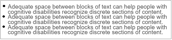 Figure 3: Tight Spacing Makes Text Difficult to Read
Guidelines cannot provide perfect text spacing for every person. Every font differs, and the letters' size and shape impact the spacing needed. For text spacing to best support good readability:
-
Start with appropriate text spacing options for the selected font.
-
Ensure people can adjust text spacing to meet their needs.
See Text Size and Spacing (Ta11y) for more information.
Choose Readable Text Styles
Avoid text styles that detract from good readability.
-
Text alignment: Left-aligned text is best for languages like English that read from left to right, especially for body text. Justified text has uneven spacing and creates rivers of white space, making content harder to read. Centered text changes the starting position with every paragraph.
-
This guidance doesn’t mean text must always be left-aligned. Specific situations may require a different text alignment
-
For example, most documents center figure captions under an image.
-
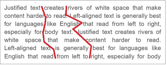 Figure 4: Justified Text Causes Rivers of White Space
-
All caps: Avoid using all in capital letters (all caps) for body text. Reading body text that is in all caps is difficult for most people.
-
Do use all caps for acronyms and initialisms.
-
You can use all caps for short, stand-alone phrases like headlines.
-
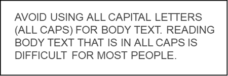 Figure 5: All Caps Makes Body Text Difficult to Read
-
Bold and italic text: Avoid large amounts of bold or italic text.
-
Choose an overall font weight that is appropriate to the font.
-
Use bold text within paragraphs only where needed for emphasis.
-
Reserve italics for parenthetical information, like citations.
-
Large amounts of bold or italic text can be more difficult for people to read, especially people with dyslexia.
-
-
Underlines: Avoid underlines for any text that is not a link.
-
Never use underlining for emphasis because of its strong association with link text.
-
People will click on underlined text because they expect it to be a link. This experience can be confusing when nothing happens.
-
-
Line length: Avoid lines of text that are too long or too short.
-
An optimal line length is 9-12 words.
-
When lines of text are longer, the eye needs to travel a greater distance from the ending point of one line and the starting point of the following line.
-
Some people with reading or vision disabilities can have trouble keeping their place when reading long lines of text.
-
Choose Readable Font Styles
Choose a font style that is appropriate to your audience and content.
Avoid overly complex or unusual fonts.
-
Reading complex or unusual fonts increases people's cognitive load.
-
Use no more than three font faces. Switching fonts increases people's cognitive load.
 Figure 6: Using Too Many or Overly Complex Fonts
Common fonts are often the best choice, especially for body text, as most people are already familiar with them. Learning a new font increases people's cognitive load. Some of the listed fonts are fully accessible. Others meet most, but not all, of the guidelines for an accessible font described in Table 1 below.
-
Some common fonts that are readable and relatively accessible include:
-
Sans-serif fonts: Verdana, Arial, Helvetica, Calibri, Roboto, Lucida Sans, and Comic Sans.
-
Serif fonts: Times New Roman, Georgia, and Book Antiqua.
-
Monospaced fonts: Courier and Courier New (monospaced fonts are often used to display code).
-
Internationalized fonts: Noto and Archivo are two examples of relatively accessible and common fonts supporting over 100 languages.
-
-
Learning a new font, even one specifically created for people with dyslexia or optimum readability, increases cognitive load.
-
These fonts are better for improved readability, but only once they are learned.
-
All of these fonts are fully accessible.
-
Dyslexic-friendly fonts: Dyslexie, Opendyslexic, EasyReading, and Read Regular.
-
Optimized-readability fonts: Atkinson-Hyperlegible, Lexend, Andika, and Castledown.
-
-
Sans-serif fonts like Arial are not always better than serif fonts like Times New Roman.
-
Sans-serif fonts were a better choice in the early days of computer monitors with low screen resolution, but it is no longer a concern with modern screen displays and higher screen resolutions.
-
Sans serif fonts are generally better for smaller text and screens due to their simplicity, but serif fonts can be a better choice in some situations, such as headings or long documents, due to their added details.
-
In general, sans serif, monospaced, and Roman font styles are more accessible than serif, proportional, and italic fonts.
-
Always evaluate the legibility and readability of every typeface individually rather than relying on generalizations.
-
Keep in mind that the typeface is only one factor in a font's accessibility.
-
Text size, weight, letter spacing, line spacing, and word spacing contribute to the font's overall accessibility.
Remember to evaluate all the fonts you specify in your style sheets. This consideration especially applies to websites where developers specify several backup fonts for use if the primary font does not load. Because people seldom see these fonts, they often forget to check them.
Select Accessible Fonts
Use the guidance in the following table when selecting a new font or typeface other than a common font or one developed for people with dyslexia. For in-depth information on accessible typefaces, see Gareth Williams Ford’s article Understanding What Makes a Typeface Accessible.
|
Guidance |
Example |
|---|---|
|
Minimize the occurrence of “imposter” letter shapes designed to be very similar to other letter shapes. |
Uppercase “i,” lowercase “L,” and the number “1” should have a notable difference. Uppercase “o” and the number “0” should also be noticeably different. |
|
Minimize the occurrence of mirroring letter shapes. |
Letters such as d and b, or q and p, should have unique shapes. For example, the letters "q" and "p" are easily confused when they are exact mirror images of each other. |
|
Have letters that are easily distinguishable from one another. |
Letters such as a, e, c, and o should be easily distinguishable. For example, the letters “o” and “c” are easily confused if the opening in the “c” is too small. This confusion can occur in both upper and lower-case letters. |
|
Have adequate letter spacing. |
Letters such as “lo,” “rn,” or “vv” can appear joined when the letter spacing is too tight. |
|
Have a visible difference between capital height and ascenders. |
Letters such as capital “i” and lowercase “L” should be recognizable by their height differences. |
You can use a text string like “Il1 O0 rnvvlo aeco qpdb” to quickly check a font’s accessibility.
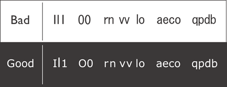 Figure 7: Letter Shape Comparison of Two Fonts
The “bad” font in the first row of text has many problems with ambiguous letter shapes and spacing.
-
The uppercase “i,” lowercase “L,” and number "1" are identical.
-
The uppercase “o” and number “0” are too similar.
-
The letter pairs “rn” and “vv” are too tightly spaced and could be mistaken for “m” and “w.”
-
The letter pairs "a e" and "c o" are difficult to distinguish.
-
The mirrored shapes of d and b, or q and p, are too similar.
The “good” font in the second row is Verdana. This font has no ambiguous letter shapes, making it much easier to recognize letters and read words.
The last image below compares three fonts that “pass” the check for accessible letter shapes. Many other fonts that pass this check are available.
-
The first font, PT Sans, is a sans-serif font.
-
The second font, Arvo, is a slab font (slab is a variation of serif fonts).
-
The last font, Georgia Pro Light, is a serif font.
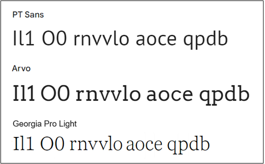 Figure 8: Three Font Examples
Ensure People Can Adjust Fonts
Reading needs are highly individual. No single set of font guidelines meets the needs of all individuals. For this reason, you must ensure that people can adjust font options to meet their needs.
See Text Size and Spacing (Ta11y) and Browser and Platform Settings (Ta11y) for more information.
Font Accessibility Quick Checks
-
Are common or dyslexic-friendly fonts used?
-
Are three fonts or less used?
-
Is the font size at least 10pt for all text?
-
Is the font size at least 12pt for body text?
-
Is text, especially body text, left justified?
-
Are “all caps” used only for acronyms?
-
Are bold and italics used only for emphasis?
-
Is underlined text avoided except for links?
-
Are line lengths optimized at 9-12 words?
Providing timely support for children, young people and families is vital. Identifying and addressing a child or family's needs early on can reduce risk factors and increase protective factors in a child's life (Early Intervention Foundation (EIF), 2021). Screening is described as the process of identifying apparently healthy people who may have an increased chance of a disease or condition (UK National Screening Committee, 2023). The screening provider then offers information, further tests and treatment. Some AHPs engage in screening of the population eg newborn screening. Other AHPs may support others in the workforce to screen or identify concerns early so they can be addressed.

How can AHPs contribute to this aspect of public health?
- Provide training/support to wider workforce to identify needs early, or undertake screening
- Develop the use of screening tools/approaches that enhance early identification of needs in the population
- Highlight risk factors which make children more vulnerable to poorer outcomes
- Engage in screening processes where appropriate
- Use opportunities to promote immunisation where appropriate
- Consider adherence to infection prevention and control
- Provide training/support to wider workforce to track progress on children’s developmental outcomes
- Support parents/carers/children in understanding benefits/risks of radiation exposure
Examples:
See4Schools Programme – Orthoptics pre-school vision screening undertaken in NHS Tayside: Fife Loves Life - Dietitians in NHS Fife developed a toolkit and training programme to undertake nutritional screening to support raising the issue of child healthy weight.
Raising Attainment for All – Speech and Language Therapists in NHS Lanarkshire developed checklists to support education staff to identify children requiring support, to monitor progress with speech, language and communication and identify what supports to put in place. Following testing within schools with the highest levels of deprivation, these were then also made available to all primary schools in North Lanarkshire.
Healthy Feet – MSK Podiatrists in NHS Ayrshire & Arran work directly with health visitors and families on early screening, prevention and interventions around MSK foot and ankle health and early gait patterns with a focus on social participation, structure/function, activity / independence and wellbeing.
Health Visitor Training – Physiotherapists in NHS Greater Glasgow and Clyde deliver online sessions for Health Visitors as part of the 13-15 month and 27-30 month pathway in order to provide advice and support on developmental milestones and early intervention and prevention of needs.
Speech, Language and Communication (SLC) resource for Health Visitors – NHS Education for Scotland worked alongside Speech and Language Therapists to develop a SLC supporting resource for Health Visitors to promote early identification of children with speech, language and communication needs and best practice in early intervention at each stage of the Universal Health Visiting Pathway.
 Reflection points
- What aspects of screening do you currently engage with?
- How do you promote early identification of needs in the wider population you work with?
- Who are the key partners you could collaborate with?

Fonts