
Alt text
Illustration, photography and graphics
Foundations: text descriptions
Posted on Monday, 24 January 2022 by Henny Swan in Design and development
Text descriptions are primary content, and when images do not have a text description, anyone who cannot see the image will not know its purpose. This means people may be unable to access content or perform related tasks.
Appropriate text descriptions provide the following benefits:
- People browsing with a desktop screen reader or browsing with a mobile screen reader who cannot see the image can hear and understand its meaning or purpose
- People browsing with speech recognition can target image buttons and graphical links by including the text description in the voice command if the image doesn't load and the text description is visible
- People on slow networks where images don't load properly or who have them switched off can read the text description shown in place of the image in some browsers
- Search engines are better able to index images with text descriptions
 Hasmukh, a blind cricketer and screen reader user, says "Emails that have graphics with no text descriptions means I can't use them! This is a big problem with meeting invites. I've actually missed a few meetings because I can't read the time or date or find the join meeting button".
Deciding the type of image
The first step is to decide what type of image it is then what kind of text description it needs.
Ask yourself:
- Does this image convey any information?
- If this image was removed:
- Would it affect the meaning of the content?
- Would it change the user's experience?
If your answer is "No, the image does not convey meaning", it is probably decorative and doesn't need a text description.
If your answer is "yes" in each case, then you may have one of the following types of image, all of which need text descriptions:
- Functional image
- Informative image
- Image of text
- Complex image
Decorative images
Decorative images are used to improve the visual appearance of the page. They don't convey any information or add to the user experience. Types of decorative images include:
- Visual styling (borders, spacers, corners)
- Images which are described by the surrounding text
Text descriptions for decorative images
Decorative images do not need text descriptions because they do not convey information or meaning. It is still important to handle decorative images in the right way though.
- HTML
- Use the alt attribute on the <img> element but do not give it a value: alt="". If a different approach is used to generate images, for example an icon font), apply aria-hidden="true" to the element used for the image.
- Android
- Use the android:contentDescription attribute on the image view, and set its value to @null
- iOS
- Set the isAccessibilityElement property on the image to false and do not provide a label
Images of text
Avoid images of text where possible because the visual quality of the text deteriorates for people browsing with screen magnification. If you have to use an image of text, the text description must contain the same words as the image itself.

Functional images
Functional images form part of interactive elements like links or buttons. The text description for a functional image should convey the intended action of the interactive element. For example, a button to start a new email might show an icon of a pen, but the text description should be "New email", not "Pen icon" because it's the button's action that's the important information.

Informative images
Informative images communicate information or add to the user experience in some way. Types of informative images include:
- Photos that show people, scenery or objects that add to the experience of the content
- Pictures of products and product variations
- Credit card symbols for payment options
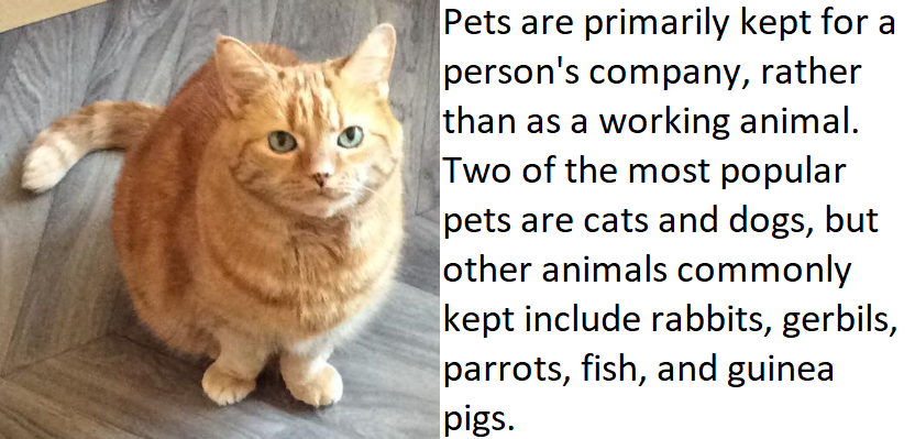
Text descriptions for images of text, functional and informative images
- HTML
- Use the alt attribute on the <img> element to add the text description
- Android
- Use the android:contentDescription on the image view to add the text description
- iOS
- Use the accessibilityLabel attribute on the image to add the text description
Complex images
Complex images convey detailed, factual information like graphs and charts, illustrations and infographics. The text description must be accompanied by a more extended description or an alternative presentation of the image.
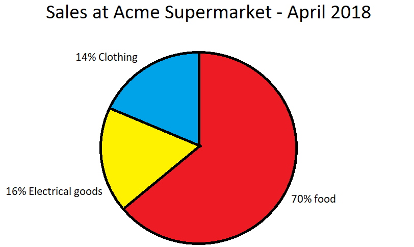
Text descriptions for complex images
- HTML
- Use the alt attribute on the <img> element to add a short text description; then either:
- Use the aria-describedby attribute to point to an element on the same page that contains a longer description of the image
- Use the <details> and <summary> elements (with the <img> element inside the <summary> element) to create a disclosure component that reveals the longer description on request
- Android
- Use the android:contentDescription on the image view to add a long text description
- iOS
- Use the accessibilityLabel attribute on the image to add a long text description
Tips for writing effective text descriptions
Think about how you would describe the image to someone on the phone. Here are some other things to think about:
- Keep text descriptions short and to the point, no more than a few words is about right
- Think about the context of the image; the same image may have a different text description depending on how it's context of use
- Do not use phrases like "picture of…", "image of…" or "… graphic" because screen readers will know it's an image based on the <img> element or the properties of the image in native apps
- If it's relevant, use phrases like "Illustration of…", "Sketch of…" or "water colour painting of…" because they can help convey the style and nature of the image
Related standards
More information
- W3C Accessibility Tutorials: Image concepts
- Tink: Text descriptions and emotion rich images
- Tink: Thoughts on text descriptions and skin tone
- MDN: HTML elements reference
Next steps
Read more accessibility foundations posts or sign up for Accessibility Unlocked, our free six-day newsletter series designed to help you kick-start accessibility.
Henny Swan
Henny is a Director. She specialises in embedded and sustainable accessibility, inclusive user experience and design.
Having started her career focusing on the usability of dual language web platforms in China in the late 1990's, Henny moved into accessibility on her return to the UK in the early 2000s. Since then she has worked for the RNIB, Opera Software, TPGi and the BBC. It was at BBC she developed her passion for inclusive TV and streaming experiences.
Henny is co-author of the Inclusive Design Principles, was lead author of the BBC Mobile Accessibility Guidelines, and is a regular speaker at conferences. In 2022 Henny graduated the Goldman Sachs 10,000 Small Businesses.
Henny Swan
© TetraLogical Services Ltd. All Rights Reserved. Company number 12951928.
Writing Alternative Text
Summary
Alternative text, or “alt text,” is a text substitute for images, graphs, videos, and other visual (non-text) elements. Although this article focuses on images, the same principles apply to all non-text elements. Alt text describes in words what sighted individuals understand by looking at the image. Alt text is added to an image so that assistive technologies like screen readers can explain images to people with visual or cognitive disabilities. Additionally, the alt text usually appears in place of an image if the image fails to load on a person's screen or if images are disabled.
Writing good alt text is an art that takes practice. Following these guidelines for writing alt text will help provide all individuals with an equitable understanding of the visual elements used on a page.
Overview
Writing good alt text requires thought. There may be times when simply describing the content of an image is sufficient, but alt text must also provide the context of the image. It must explain the “why” of the image as it relates to the content on the page. The need to provide context is why software that generates automatic alt text usually fails to provide good alt text - even when it is accurate.
Alt text should:
-
Tell people why the image is there based on its context.
-
Be concise and only describe the essential information about the image.
-
Explain the image in a meaningful way that provides an equitable experience for people who cannot see or understand the image.
Alternative text is added to an image so that people who use assistive technologies can understand the image. Usually, only individuals using assistive technologies like screen readers are aware of the alt text. Labels, captions, and text descriptions are other methods of supplying text alternatives. Unlike alt text, these text alternatives are available to everyone. Different types of images require different techniques to make them fully accessible. For example, a complex chart needs a more in-depth text alternative than a “search” icon.
Watch this short WhatsIn Store video from the Royal National Insitute for the Blind (RNIB) for a quick insight into the importance of describing items to individuals who cannot see them. This same experience applies to describing images on a web page or document.
See Understanding Image Accessibility (Ta11y) for information on handling different types of images.
Who is Helped
Individuals who are blind or have trouble processing visual information will read a page using a screen reader or other text-to-speech software.
-
Screen readers tell users when there is an image, and the alt text, if available, is read. The alt text should tell people relying on assistive technology what information the image contains and why it is there. Without the alt text, screen reader users know there is an image, but instead of hearing a description of the image, they hear the filename.
-
Keeping alt text succinct will help screen reader users understand the primary purpose of the image. You can add a longer text description before or after the image if more details are necessary.
Some people with low vision or certain cognitive disabilities turn off images to simplify screen content. They see the alt text instead of the image, and they rely on alternative text to tell them what is important about the image.
An image may be more difficult for people with low vision to understand. Often, these individuals need to change colors, font size, or zoom settings to understand information. These adjustments do not work well with images, so people with low vision may also turn off images and rely on alt text to understand the image.
All of us are helped by alternative text when images do not load or are disabled. If you’ve ever seen an email with disabled images or a web page where the images don’t load correctly, you also needed alternative text to understand the images.
Design Principles
The person who understands the image best is the person who should write the alt text. This person is usually the content’s original author, a content writer, or a designer - not a developer. Because writing alt text is subjective, it is important to understand the story behind the image and its place within the overall story of the web page and site.
Start by asking yourself, “If I couldn’t use this image, what would I say instead?” Imagine yourself describing the image to someone sitting next to you who couldn’t see it. What does it look like? Why is it there? What function does it serve within the context of the page? How would you answer these questions?
How to Write Alternative Text
There are many approaches to writing alt text. Bojana Coklyat and Shannon Finnegan, authors of the “Alt Text as Poetry” workbook, state that:
“We don’t just want alt-text users to be able to access visual content on the internet; we want them to feel a sense of belonging in digital spaces.”
Attention to language and word economy are aspects of poetry that also apply to alt text. These practical considerations, combined with a poetic mindset, can create thoughtful alternative text that provides a meaningful experience for people who cannot see or understand images directly.
While writing alternative text always involves subjectivity, you can combine the following four principles with thoughtfulness and empathy to meet the needs of a good accessibility practice. This effort will result in an equitable understanding of an image for all individuals.
Principle #1: Describe the image.
-
Use the image’s subject as an initial guide.
-
Consider both the content and the function of the image.
-
Keep the description accurate and concise, and avoid redundancy.
-
Do not add information to the image that a sighted person cannot see. Do not try to interpret the image, editorialize, or expand the meaning of the image.
Principle #2: Be concise.
-
Do not include “image of” or “picture of” in your alt text.
-
Screen readers automatically state when an image is an image. For example, the alt text “Image of a dog” would be read aloud by a screen reader as “image image of a dog.” Avoiding this redundancy reduces the “noise” screen reader users hear.
-
If the type of image is important to its context, such as a cartoon or a bar chart, include that in the alt text.
-
-
Try to avoid alt text that is longer than 125 characters.
-
This limit is not a hard and fast rule, but you should try to keep text in the “alt” attribute of an image to around 125 characters or less. Long alt text can distract from the content and decrease the user experience for people who rely on screen readers.
-
Screen readers read “alt” text straight through, and users cannot control the screen reader. For example, there is no way to pause and restart reading or to read an acronym or an ambiguous word one letter at a time. There is also no way to format alt text, which can limit a user’s understanding of its content.
-
Avoid including links in alt text unless they are short and understandable when read by a screen reader, as in “accessiblecommunity.org.” Long links combining text, numbers, and special characters are always difficult for screen readers users to understand and will be completely unusable when located in the alt text.
-
Keep in mind that alt text is displayed if images are disabled. If the alt text is too long, this can cause display issues.
-
If the image requires a longer description, include it in the content as a caption or descriptive text to allow for a shorter alt text.
-
Principle #3: Consider the context of the image.
-
Context is a critical consideration when writing alt text.
-
Ask yourself:
-
What does the image convey, given the context of the page?
-
What is the purpose of the image? Why is it here?
-
How does the image support the content?
-
-
Use the alt text to provide the context. As an example, the alt text for an image of a man typing on a computer might be any of these options, depending on its context:
-
Man typing on a computer.
-
Man writing a novel.
-
Stephen King writing his next book.
-
Principle #4: Consider the purpose of the image.
-
Is the image used as a link?
-
The alt text should describe the link’s destination, not the image.
-
If the linked image contains text, then the alt text should include the text in the image.
-
-
Is the image used as a button?
-
The alt text should describe the button’s function, not the image.
-
If the button contains text, the alt text should repeat the text exactly.
-
-
Is the image decorative?
-
Most images should include an alt text to increase user experience and accessibility. However, images that are not informative or functional should be hidden from assistive technology rather than described.
-
If an image is purely decorative - meaning it is used only to enhance the design and does not serve a function or convey any meaning or important information - mark it as decorative.
-
Be thoughtful when deciding if an image is decorative or not. You should always consider why an image was added to a page when determining if it is decorative. If the image adds value for sighted individuals, it will add value for people who are blind, and you should describe it. Craig Abbott’s article, How to write good alt text for screen readers, explains why you must use care when deciding that an image is decorative.
-
Examples of Alternative Text
These examples illustrate the basic guidelines for writing good alt text. The examples are intentionally simple so that they clearly illustrate a particular point. Even so, there may be times when you disagree with the alt text in the examples. That’s to be expected. Remember what we said about alt text being subjective? Think about these examples as you read them. Ask yourself, “What would I write for alt text in this case?”
Note: To best illustrate the alternative text guidelines, the images in these examples are not numbered and have been coded with an alternative text of “example image” The text of the example provides the image’s description.

This image shows a young woman sitting at a table with a laptop directly in front of her and a meal that looks like breakfast to one side. She is leaning toward the laptop and studying the screen or typing. The image is on the Accessible Community home page. The image intends to portray someone using the accessibility assessment tool Ta11y.
The first five examples use this same image.
Example 1: Image by Itself (Informative)
Context: This example uses the image by itself. On the web page, below the image, there is information that describes the Ta11y tool. The image is intended to help readers visualize themselves using Ta11y and is considered informative.
Consider these options for alt text:
-
“Young woman learning accessibility with Ta11y.”
-
“Young woman learning accessibility with Ta11y is ready to take the certification exam.”
-
“Young woman using a laptop while having breakfast.”
-
“Image of a Young woman learning accessibility with Ta11y.”
Option A would be appropriate because it is accurate, succinct, avoids redundancy, and conveys the context.
Option B contains additional information that is not part of the image. This information is more appropriate for text elsewhere on the page describing the image.
Option C is factually accurate but ignores the image's context. In another context, this might be appropriate.
Option D is redundant because it describes the image as an image.
In this example:
-
The alt text is ”Young woman learning accessibility with Ta11y.”
-
The screen reader will say, “Image Young woman learning accessibility with Ta11y.”
Example 2: Image with a Caption (Decorative)
Images often have captions below them. Captions provide information about the image but serve a different purpose from alt text. Alternative text Images often have captions below them. Captions provide information about the image but serve a different purpose from alt text. Alternative text generally describes the image's appearance or why it is there, while captions provide basic facts about it. Both are valuable. Write the captions and alt text to complement each other if you include both. Do not make them redundant.
If a caption fully describes an image’s content, treat the image as decorative. No alternative text is necessary because the caption acts as a sufficient substitute.
Context: Example 2 uses the same image from the Accessible Community home page as Example 1, this time with a caption that fully describes the image.
 Young woman learning accessibility with Ta11y
In this case, the image of the young woman using a laptop while having breakfast is treated as decorative. Assistive technologies like screen readers will ignore the image but read the caption.
-
Mark the alt text as decorative (alt=””).
-
The screen reader will say, “Caption Young woman learning accessibility with Ta11y”
Example 3: Image with a Caption (Informative)
What if an image had a caption, but the caption didn’t fully describe the image? In this case, treat the image as informative and provide an alt text. You can use captions to convey partial information about an image, while the alt text provides the full context.
Context: Example 3 looks at the same image from the Accessible Community home page, this time with a caption below it that provides some information about the image but not enough to understand it fully.In this case, the caption hints at why the image is there but doesn’t make sense if you can’t see the image. You must use the alt text to supply the missing context.
-
The alt text is ”Young woman using a laptop to learn about accessibility with Ta11y.”
-
The screen reader will say, “image young woman using a laptop to learn about accessibility with Ta11y. Caption want to learn more about Accessibility?”
Example 4: Image used as a Link without Text (Functional)
Some images serve a function, such as a link or a button. These are referred to as functional images. Alt text for functional images should describe the element's function, not its appearance.
Images used as links should describe the link’s destination. For example, an image of a house that links to a website’s home page would have an alt text of “home page” rather than “house.” The alt text for this type of image should convey the purpose of the image (the action that takes place) rather than a description of the image.
Context: Look again at the same image from the Accessible Community home page. This time, the image includes a link. You are taken to the Ta11y home page when you click on the image.

Since no adjacent text describes the link's function, the image’s alt attribute must provide the description.
Consider these options:
-
“Read more”
-
“Website for the accessibility assessment tool Ta11y. Use Ta11y and start learning about accessibility today!”
-
“Ta11y.org"
-
An empty alt attribute
Option A does not provide adequate information about what happens when the linked image is selected.
Option B contains information not essential to the image’s purpose. This additional information is better located within the text on the page describing the Ta11y tool.
Option C is the best option as it describes the link’s function concisely (takes you to the Ta11y website). In this instance, the purpose of the image is what’s important. It would be even better if this image had a visible text label, as shown in the next example.
Option D is inappropriate because a link or button containing an image without a caption or adjacent text does not provide sufficient information for a screen reader. With an empty alt text, screen readers will likely read the URL of the linked page or the image filename, which is not helpful to the user. When adjacent image and text links go to a single destination, combine them within a single link and treat the image as decorative. In this case, the link’s text supplies the text alternative needed to explain the image’s function.
It’s best always to add a visible label when using an image as a link or button. Adding a visible text label to a linked image helps everyone understand what happens when using the link. Without this visual cue, people using assistive technologies like screen readers who hear the alt text may better understand the link than others. Take another look at the linked image in Example 4. There might be text before or after the image that explains what happens when you click on it, but it’s not obvious from looking at the image. However, with the right alt text screen reader users will know that clicking on the image takes them to the Ta11y home page.
Note: Icons used as links or buttons should also add a visible text label to ensure understanding. Only well-known icons like the magnifying glass that indicates “search” should be used without a visible label.
Context: The next example shows a linked image with a linked text label immediately below it. Whether you click on the image or the text, you will go to the Ta11y home page. This example is the last use of the image from the Accessible Community home page.
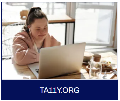
In this example, the image and adjacent text label are in a single link. Treat the image as decorative, and use the adjacent text to supply the text alternative of “TA11Y.ORG.”
-
The screen reader ignores the image since it is decorative.
-
The screen reader will say, “link Ta11y.org.”
Always combine adjacent image and text links that target the same destination into a single link. This coding technique avoids unnecessary repetition for keyboard navigators and screen reader users. If the image and text are two separate links, keyboard navigators will have an extra tab stop and screen reader users will have to hear the link information twice.
Example 6: Image used as a Button (Functional)
As with links, alt text for functional images used as buttons should describe the image's function, not its appearance. There is usually no visible text label when using an image as a button. In this case, the alt text added to the image should match the text in the image.
The alt text for the button image with the word “Login” should be “Login.”
-
In this example, the alt text is “Login.”
-
The screen reader will say, “button login.”
Having the alt text match the text in the image is important because forms using buttons often contain text that refers to the button. For example, the text on a web page may tell people to “click the Next button to go to the next page.” If the alt text for the button’s image says “Continue” instead of “Next,” then people using screen readers who cannot see the image will be confused.
Images of Text
Avoid using images of text whenever possible. When you must use images containing text, you must also provide a text alternative that duplicates the text in the image.
-
For example, if an image contains text announcing the date and location of an event, you must include that text in the alt text, add it as additional text on the page, or both.
-
Determining the best location for the text alternative depends on the length of the text. The alt text and the text description on the page combine to provide a complete text alternative.
Images of People
Positive representation in imagery affects how people see themselves, and how others see them. That representation needs to be diverse, positive, and accurate—and so does the alt text.
-
Alt text describing people must be accurate and positive.
-
You must always consider the context when describing people.
-
Include information about race, gender, age, and disability when it is essential to understanding the image based on its context.
Complex Images
Complex images such as charts, graphs, and infographics often require more explanation than can be conveyed with the typical 125-character alt text. Add longer explanations to the text of a page to supplement the image’s alt text. Use labels, captions, and additional text in the content to supply these other text alternatives. The alt text and the text descriptions combine to provide a complete text alternative.
-
The length of the text description needed to explain a complex image depends on the context.
-
The combined text alternatives should provide an equivalent experience for someone who cannot see the image.
-
The additional text for charts and graphs often includes a table. It is common practice on websites and spreadsheets to have a button that allows users to switch between a chart and a table.
Providing timely support for children, young people and families is vital. Identifying and addressing a child or family's needs early on can reduce risk factors and increase protective factors in a child's life (Early Intervention Foundation (EIF), 2021). Screening is described as the process of identifying apparently healthy people who may have an increased chance of a disease or condition (UK National Screening Committee, 2023). The screening provider then offers information, further tests and treatment. Some AHPs engage in screening of the population eg newborn screening. Other AHPs may support others in the workforce to screen or identify concerns early so they can be addressed.

How can AHPs contribute to this aspect of public health?
- Provide training/support to wider workforce to identify needs early, or undertake screening
- Develop the use of screening tools/approaches that enhance early identification of needs in the population
- Highlight risk factors which make children more vulnerable to poorer outcomes
- Engage in screening processes where appropriate
- Use opportunities to promote immunisation where appropriate
- Consider adherence to infection prevention and control
- Provide training/support to wider workforce to track progress on children’s developmental outcomes
- Support parents/carers/children in understanding benefits/risks of radiation exposure
Examples:
See4Schools Programme – Orthoptics pre-school vision screening undertaken in NHS Tayside: Fife Loves Life - Dietitians in NHS Fife developed a toolkit and training programme to undertake nutritional screening to support raising the issue of child healthy weight.
Raising Attainment for All – Speech and Language Therapists in NHS Lanarkshire developed checklists to support education staff to identify children requiring support, to monitor progress with speech, language and communication and identify what supports to put in place. Following testing within schools with the highest levels of deprivation, these were then also made available to all primary schools in North Lanarkshire.
Healthy Feet – MSK Podiatrists in NHS Ayrshire & Arran work directly with health visitors and families on early screening, prevention and interventions around MSK foot and ankle health and early gait patterns with a focus on social participation, structure/function, activity / independence and wellbeing.
Health Visitor Training – Physiotherapists in NHS Greater Glasgow and Clyde deliver online sessions for Health Visitors as part of the 13-15 month and 27-30 month pathway in order to provide advice and support on developmental milestones and early intervention and prevention of needs.
Speech, Language and Communication (SLC) resource for Health Visitors – NHS Education for Scotland worked alongside Speech and Language Therapists to develop a SLC supporting resource for Health Visitors to promote early identification of children with speech, language and communication needs and best practice in early intervention at each stage of the Universal Health Visiting Pathway.
 Reflection points
- What aspects of screening do you currently engage with?
- How do you promote early identification of needs in the wider population you work with?
- Who are the key partners you could collaborate with?

Illustration, photography and graphics